|
|
楼主 |
发表于 2011-12-14 22:43
|
显示全部楼层
美国信号参考比较
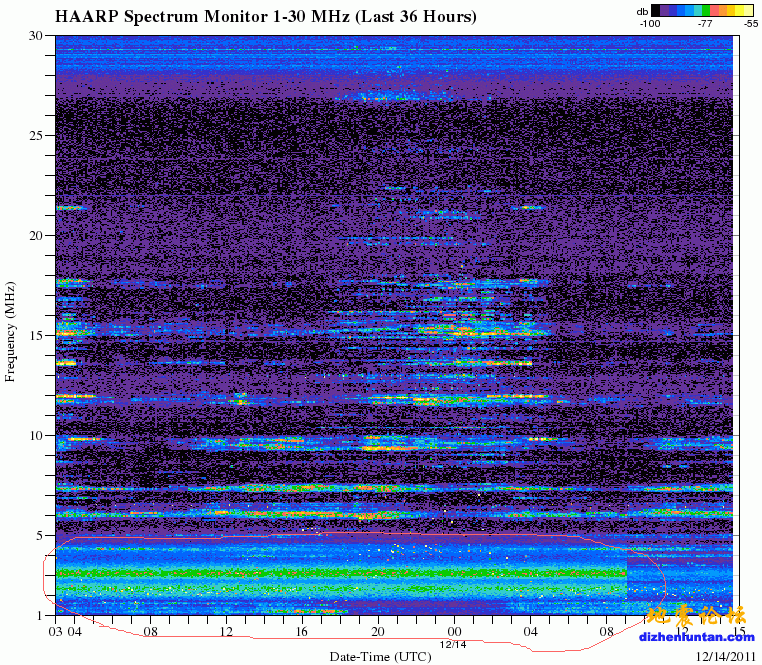
This chart is a waterfall plot of the readings taken by the Spectrum Monitor for the last 36 hours. The vertical axis is the frequency, ranging from 1 - 30 Mhz and the horizontal axis is the UTC time. Spectrum samples are taken every few minutes. The color indicates intensity of received signal at each frequency, ranging from deep blue for the weakest signals to red, yellow and white for the strongest signals.
这个图表是一个瀑布频谱监视器在过去的36小时内采取的读数图。纵轴是频率,范围从1 - 30 MHz和横轴是UTC时间。频谱样本采取每隔几分钟。颜色表示在每个频率的接收信号强度,信号最弱的深蓝色,红色,黄色和白色的最强信号的范围。

|
|
 /1
/1 